Wave 1
Card
A raised surface grouping related content and actions. Server-component safe.
- Purely decorative boxes around every section; use spacing instead.
Install
Terminal
pnpm dlx shadcn@latest add @acme/cardOr import from the package: import { Card } from '@acme/react'
Examples
Basic
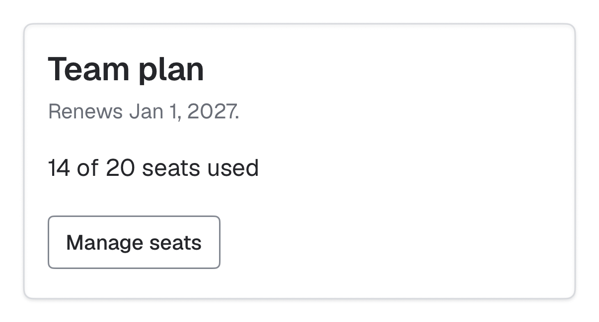
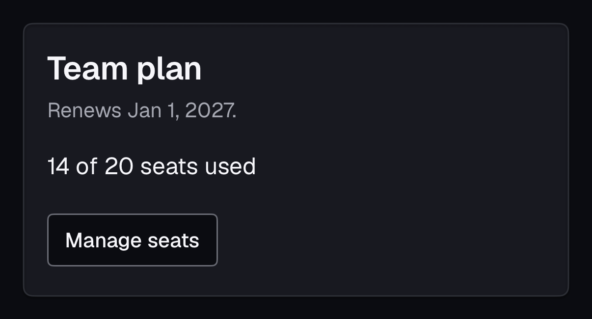
Team plan
Billed annually. Renews on Jan 1, 2027.
Active14 of 20 seats used
card-basic.tsx
import { Badge } from '@/components/ui/badge'
import { Button } from '@/components/ui/button'
import {
  Card,
  CardContent,
  CardDescription,
  CardFooter,
  CardHeader,
  CardTitle,
} from '@/components/ui/card'

export default function CardBasic() {
  return (
    <Card className="max-w-sm">
      <CardHeader>
        <CardTitle>Team plan</CardTitle>
        <CardDescription>Billed annually. Renews on Jan 1, 2027.</CardDescription>
      </CardHeader>
      <CardContent className="flex items-center gap-2 text-body-sm">
        <Badge variant="success">Active</Badge>
        <span>14 of 20 seats used</span>
      </CardContent>
      <CardFooter>
        <Button variant="outline">Manage seats</Button>
      </CardFooter>
    </Card>
  )
}
Native
The same component for iOS (SwiftUI, AcmeUI) and Android (Jetpack Compose, com.acme.ui), built on each platform's own controls with the same tokens.
AcmeCard
Swift
AcmeCard("Team plan", description: "Renews Jan 1.") {
    Text("14 of 20 seats")
} footer: {
    AcmeButton("Manage seats", variant: .outline) { }
}- The title is a heading for the VoiceOver rotor.
Props
| Prop | Type | Default | Description |
|---|---|---|---|
| CardTitle.as | 'h2' | 'h3' | 'h4' | 'h5' | 'h6' | 'div' | 'h3' | Heading level that fits the page outline. |
Accessibility
- You provide
- Pick a CardTitle heading level that keeps the page outline in order.
- WCAG 2.2 criteria
- 1.3.1, 2.4.6
Don’t
- Make a whole card clickable with nested buttons inside.
Tokens
- color.card
- color.card-foreground
- color.border
- elevation.1
- radius.lg