Dialog
A modal window for a focused task or a decision that blocks the page until dismissed.
- Non-blocking info: use Alert or Toast.
- Long multi-step flows: use a page.
Install
Terminal
pnpm dlx shadcn@latest add @acme/dialogOr import from the package: import { Dialog } from '@acme/react'
Examples
Basic
dialog-basic.tsx
import { Button } from '@/components/ui/button'
import {
  Dialog,
  DialogClose,
  DialogContent,
  DialogDescription,
  DialogFooter,
  DialogHeader,
  DialogTitle,
  DialogTrigger,
} from '@/components/ui/dialog'

export default function DialogBasic() {
  return (
    <Dialog>
      <DialogTrigger render={<Button variant="destructive" />}>Delete project</DialogTrigger>
      <DialogContent>
        <DialogHeader>
          <DialogTitle>Delete “Northwind redesign”?</DialogTitle>
          <DialogDescription>
            This removes the project, its 42 files and its history for everyone. You can’t undo
            this.
          </DialogDescription>
        </DialogHeader>
        <DialogFooter>
          <DialogClose render={<Button variant="outline" />}>Cancel</DialogClose>
          <DialogClose render={<Button variant="destructive" />}>Delete project</DialogClose>
        </DialogFooter>
      </DialogContent>
    </Dialog>
  )
}
Native
The same component for iOS (SwiftUI, AcmeUI) and Android (Jetpack Compose, com.acme.ui), built on each platform's own controls with the same tokens.
.acmeDialog / .acmeSheet
Swift
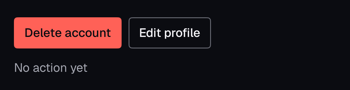
.acmeDialog("Delete your account?", isPresented: $confirm, message: "This can't be undone.") {
    Button("Delete account", role: .destructive) { delete() }
    Button("Cancel", role: .cancel) { }
}- Confirmations use the system alert; content uses a themed sheet. Focus, VoiceOver and dismissal are the platform's.

Props
| Prop | Type | Default | Description |
|---|---|---|---|
| open / defaultOpen | boolean | — | Controlled or initial state. |
| onOpenChange | (open: boolean) => void | — | Called when the dialog opens or closes. |
| DialogContent.showCloseButton | boolean | true | Show the X button. |
| DialogTrigger.render | ReactElement | — | Style the trigger: render={<Button variant="outline" />}. |
Accessibility
| Key | Action |
|---|---|
| Tab / Shift+Tab | Cycle focus inside the dialog |
| Escape | Closes and returns focus to the trigger |
- Role
- dialog (aria-modal)
- You provide
- A DialogTitle.
- A visible way to close (X button or Cancel).
- Built in
- Focus is trapped while open and restored on close.
- Page scroll is locked; content outside is inert.
- Scale animation is removed under prefers-reduced-motion.
- WCAG 2.2 criteria
- 2.1.2, 2.4.3, 2.4.11, 4.1.2
Don’t
- Open a dialog on page load.
- Nest dialogs more than one level.
Tokens
- color.popover
- color.popover-foreground
- color.scrim
- elevation.3
- radius.lg
- z.overlay
- z.modal