Switch
Turns a setting on or off immediately.
- A choice submitted later with a form: use Checkbox.
Install
Terminal
pnpm dlx shadcn@latest add @acme/switchOr import from the package: import { Switch } from '@acme/react'
Examples
Basic
Ask for a code when signing in on a new device.
switch-basic.tsx
import { Field, FieldDescription } from '@/components/ui/field'
import { Label } from '@/components/ui/label'
import { Switch } from '@/components/ui/switch'

export default function SwitchBasic() {
  return (
    <div className="flex max-w-sm flex-col gap-4">
      <Field>
        <Label className="justify-between">
          Two-factor authentication
          <Switch name="twoFactor" defaultChecked />
        </Label>
        <FieldDescription>Ask for a code when signing in on a new device.</FieldDescription>
      </Field>
      <Field>
        <Label className="justify-between">
          Weekly digest
          <Switch name="digest" />
        </Label>
      </Field>
    </div>
  )
}
Native
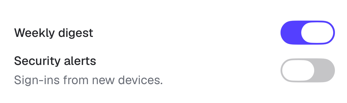
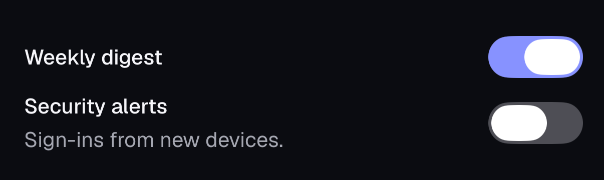
The same component for iOS (SwiftUI, AcmeUI) and Android (Jetpack Compose, com.acme.ui), built on each platform's own controls with the same tokens.
AcmeSwitch
Swift
AcmeSwitch("Weekly digest", isOn: $digest)- The system switch, tinted with primary. Applies immediately; use a checkbox in forms with a submit button.
Props
| Prop | Type | Default | Description |
|---|---|---|---|
| checked / defaultChecked | boolean | — | On/off state. |
| onCheckedChange | (checked: boolean) => void | — | Apply the setting here. |
Accessibility
| Key | Action |
|---|---|
| Space | Toggles |
| Enter | Toggles |
- Role
- switch
- You provide
- Wrap in a Label inside a Field.
- Built in
- Off track uses --input (3:1 against the page); the thumb meets 3:1 against both tracks.
- Thumb motion is removed under prefers-reduced-motion.
- WCAG 2.2 criteria
- 1.4.11, 2.3.3, 4.1.2
Don’t
- Require a Save button after toggling a switch.
Tokens
- color.input
- color.primary
- color.background
- color.ring
- elevation.1